
Tina BE — Website Rebrand & Digital Experience
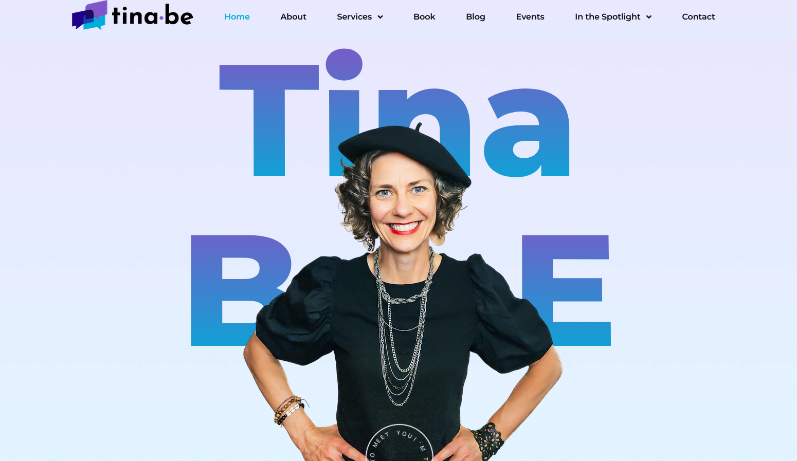
Tina BE has a distinctive personality and a broad range of work, so the website needed to feel expressive without sacrificing clarity.
More From This Project
Bringing a New Brand Identity to Life Online
The challenge was to create a digital experience that felt as expressive, energetic, and authentic as the Tina BE brand, while still keeping the website easy to navigate and the different aspects of her work clearly organized.
The result is a website that combines personality-driven design with a structured user experience — creating a digital home for Tina BE's coaching, speaking, events, content, and other offerings.
Translating the New Brand Into a Website
The client's existing logo and brand guide provided the foundation for the redesign.
We used the established colors, typography, visual elements, and overall brand direction to create a consistent design system for the website.
Rather than applying the brand elements mechanically, we adapted them for the web — considering how the colors work across different sections, how typography creates hierarchy, and how visual elements can be used without making the pages feel cluttered.
The result is a website that feels like a natural extension of the new Tina BE identity rather than a separate digital interpretation of it.
Designing for Personality & Expression
Tina BE has a distinctive personality and a broad range of work, so the website needed to feel expressive without sacrificing clarity.
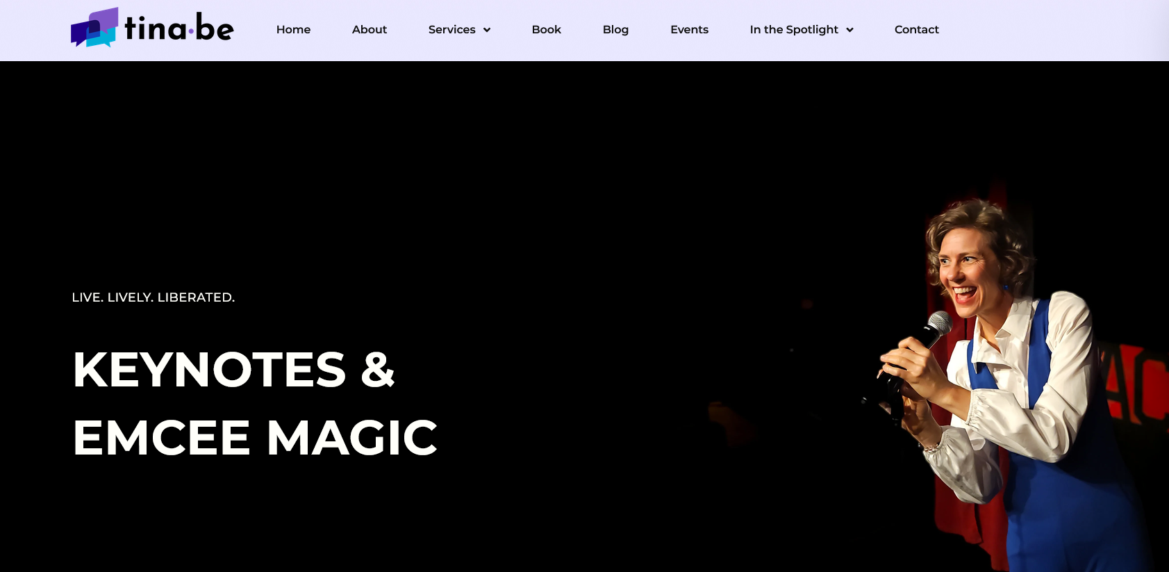
The layouts use strong typography, photography, color, and varied content sections to create visual rhythm throughout the site.
We avoided a rigid, template-like structure and instead introduced different layouts and visual treatments across sections. This gives the website a more editorial and personal feel while still maintaining a consistent design system.
The goal was to create a website that feels confident, energetic, playful, and human — qualities that are central to the Tina BE brand.
Creating Structure Around a Diverse Offering
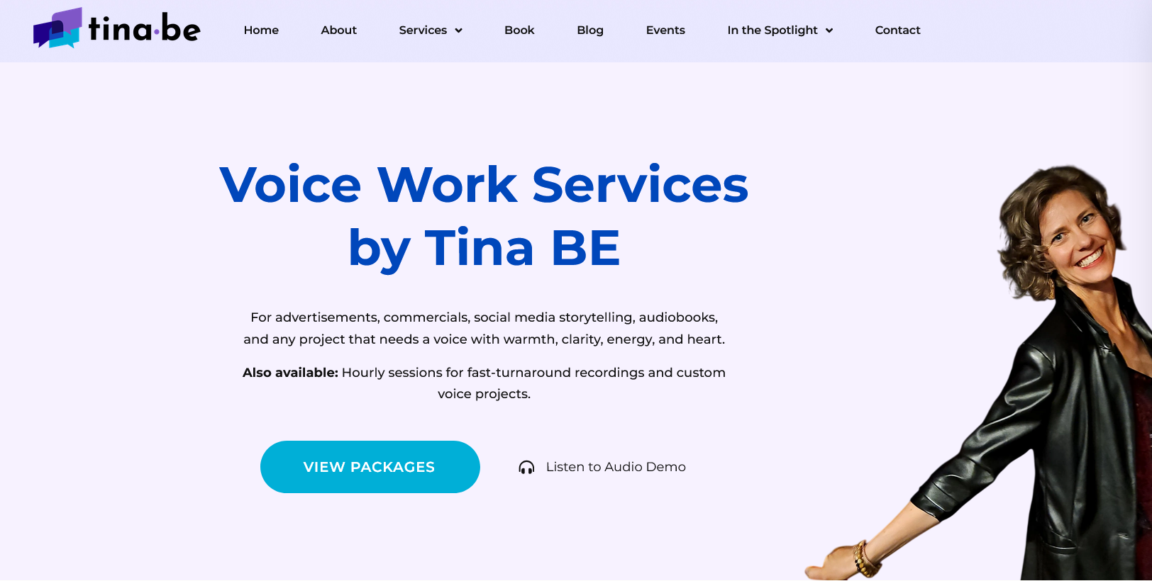
Tina BE's work spans several areas, from intuitive communication coaching and keynotes to team workshops, voice work, content, and events.
With so many different offerings, clear information architecture was important.
We structured the website so visitors can quickly understand the different ways they can engage with the brand, while still being able to explore Tina's broader work and content.
This balance between personality and structure was an important part of the redesign.
The website can feel expressive and unconventional while still helping visitors find what they're looking for.
Bringing Content Into One Digital Home
The website brings together the different content and platforms that make up the Tina BE ecosystem.
Alongside the core website content, we integrated her Spotify podcast, allowing visitors to discover and listen to episodes without having to leave the broader brand experience.
The website also provides space for her other content, including her book, blog, media appearances, speaking work, and events.
Instead of treating each platform as a separate destination, the website acts as a central hub connecting these different parts of the brand.
Extending the Brand Beyond the Website
The project also included creating supporting digital assets to ensure the new brand remained consistent across Tina BE's communications.
We designed new newsletter banners that aligned with the visual language of the redesigned website.
We also integrated event ticketing functionality, giving visitors a straightforward way to discover and register for upcoming events.
These additions helped turn the website from a purely informational platform into a more functional part of the overall business ecosystem.
A Website That Feels Like Tina BE
The final website brings the new brand identity, content, services, and functionality together into one cohesive experience.
The redesign provides a flexible foundation for the brand to continue growing while keeping the experience consistent across its different offerings.
From the visual identity and page layouts to the Spotify podcast integration, newsletter assets, and event ticketing, every element was designed to work together as part of the same digital ecosystem.
The result is a website that is bold without being overwhelming, personal without being informal, and expressive without compromising usability.
What We Delivered
- Website rebrand and redesign
- Brand guide implementation
- Custom website design and development
- Responsive layouts
- Content and information architecture
- Spotify podcast integration
- Event ticketing integration
- Newsletter banner design
- Visual design system for the website
- Conversion-focused user journeys
Final Thoughts
A new brand deserves a digital experience that feels just as intentional. At Devtoniq, we help businesses and personal brands translate their identity into websites that are not only visually cohesive, but also practical, engaging, and built around how their audiences actually interact with them.
Let's work togetherYou Might Also Like
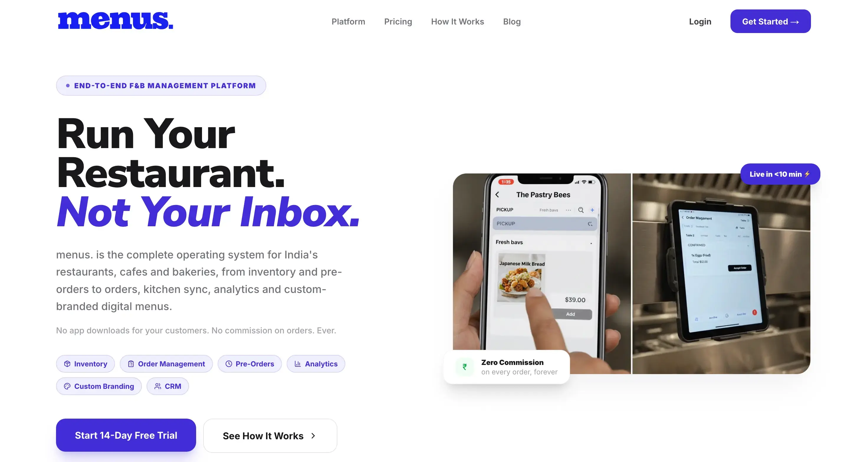
menus. — F&B Management Platform
A full-stack F&B management platform built by Devtoniq with Next.js. menus. brings digital menus, ordering, pre-orders, inventory, kitchen management, analytics, CRM, and custom branding into a single system designed specifically for restaurants, cafés, and bakeries.
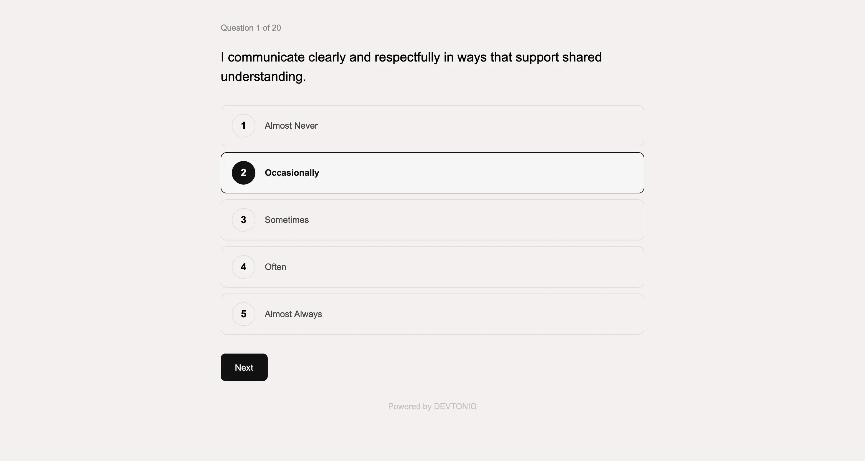
Custom Quiz & Assessment Platform
A custom interactive quiz and assessment platform built from a detailed client brief. I translated the client's questions, scoring logic, and result requirements into a complete experience—from the front-end Q&A flow to automated scoring, backend response management, and personalized email results.
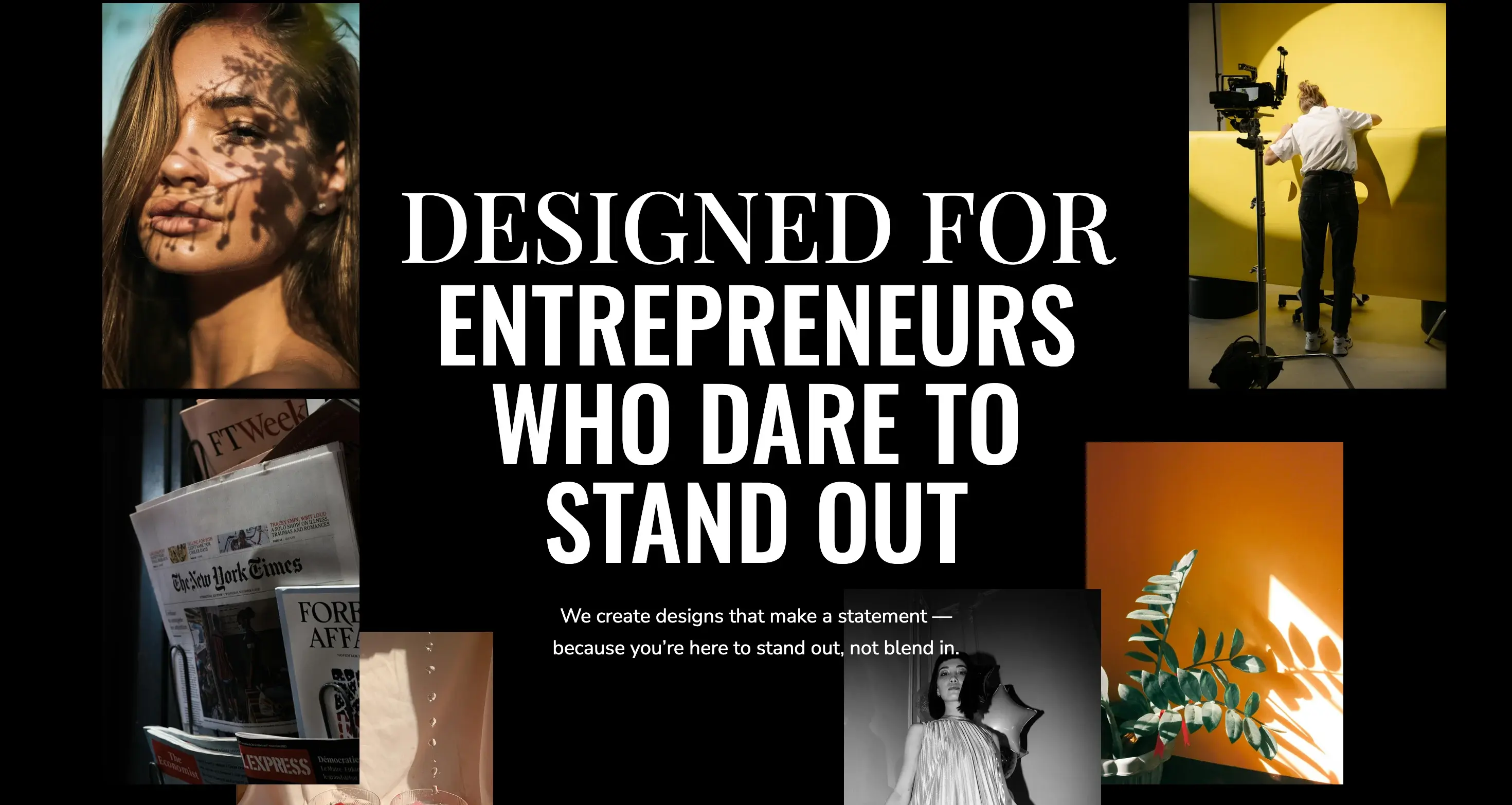
Elia — Multi-Platform Website Template
Elia is a modern, editorial-inspired website template designed for creative entrepreneurs, agencies, and personal brands. Built by Devtoniq, the template combines bold typography, expressive layouts, and conversion-focused sections to create a polished digital presence without sacrificing usability.