
Web Design Process: Healing Spaces Coaching Through Wholeness
Healing Spaces Coaching through Wholeness is a coaching and consulting practice created to support therapists, healing practitioners, and other people who spend their lives caring for others.
More From This Project
Creating a Website for Healing Spaces
Healing Spaces Coaching through Wholeness is a coaching and consulting practice created to support therapists, healing practitioners, and other people who spend their lives caring for others.
The goal of the website was to create a digital space that felt as intentional and welcoming as the work itself — while making it easier for visitors to understand the services, explore available programs, and take the next step.
Services: Web Design & Development, Brand-Led UI Design, Payment Integration Client: Healing Spaces Coaching through Wholeness, LLC
Starting With the Brand
The project started with an existing logo provided by the client.
Rather than creating a completely separate visual direction for the website, we used the logo as the foundation for the site's visual language.
We looked at the shapes, colors, proportions, and overall personality of the logo and translated those elements into the rest of the website.
This helped us establish a visual system that felt like a natural extension of the existing brand rather than a disconnected website design.
The logo informed:
- Color palette
- Typography
- Button styling
- Section layouts
- Spacing and proportions
- Visual hierarchy
- Overall tone of the website
The result was a website that felt cohesive from the first interaction through to the individual program pages.
Creating the Right Visual Direction
Healing Spaces deals with deeply personal subjects, so the website needed to feel approachable without becoming overly clinical.
We wanted the design to communicate:
Calm. Warmth. Trust. Support. Human connection.
Instead of filling the website with decorative elements, we used whitespace, typography, color, and carefully structured sections to create a sense of breathing room.
The design needed to feel professional enough to establish credibility while still feeling personal and welcoming.
Color & Typography
The visual identity for Healing Spaces was developed directly from the client's existing logo. Rather than introducing an unrelated color palette or visual style, we used the logo as the starting point and extended its colors and personality throughout the website.
The result is a warm, grounded palette that balances softness with enough contrast to create a clear and confident visual hierarchy.
Color Palette
#FAE0DA — Soft Blush Used as a light, warm background color to create a sense of softness and openness throughout the website.
#A2511D — Warm Terracotta Used as a stronger brand accent for important visual elements, creating warmth and adding contrast to the softer tones.
#76A49F — Muted Teal Introduces a calming, natural quality to the interface and creates visual contrast against the warmer blush and terracotta tones.
#292929 — Charcoal Used primarily for typography and darker interface elements, providing strong readability without the harshness of pure black.
Together, the four colors create a balance between warmth, calm, contrast, and approachability — qualities that align naturally with the Healing Spaces brand.
Typography
Typography was also taken directly from the visual language established by the client's logo.
We used Contax Sans as the primary typeface across the website.
The typeface was intentionally used in two different treatments to create hierarchy while keeping the overall visual identity consistent.
Headings
CONTAX SANS — ALL CAPS
Headings use uppercase typography to create stronger visual presence and establish clear section breaks.
Body Copy
Contax Sans — Regular
Body copy uses the same typeface in its normal case, creating a softer and more readable contrast against the uppercase headings.
The Type System
| Element | Typeface | Treatment | | ---------- | ----------- | ----------- | | H1 | Contax Sans | Uppercase | | H2 | Contax Sans | Uppercase | | H3 | Contax Sans | Uppercase | | Body | Contax Sans | Normal case | | Paragraphs | Contax Sans | Normal case | | Buttons | Contax Sans | Uppercase |
The combination of uppercase headings and normal-case body copy gives the website a distinctive rhythm while keeping longer sections comfortable to read.
A Visual Language Built From the Logo
Rather than treating the logo as an isolated asset, we used it as the foundation for the entire website's visual language.
The color palette establishes the mood, while the typography creates hierarchy and personality.
Together, these elements helped us create a digital experience that feels cohesive with the original Healing Spaces identity while giving the brand a stronger and more complete presence online.
Building a Clear Content Structure
One of the most important parts of the project was organizing the information into a structure that visitors could easily navigate.
The website brings together several different aspects of the practice, including:
- Coaching programs
- Individual consultation
- Group consultation
- Life coaching
- Therapy
- Founder information
- Education and professional experience
Rather than presenting everything at once, we created a clear hierarchy that allows visitors to understand the practice first and then explore the specific services that are relevant to them.
The main navigation was kept simple, with dedicated sections for the About, Programs, Contact, and supporting information.
Designing the Homepage
The homepage was designed to answer three questions quickly:
Who is this for?
The website immediately introduces Healing Spaces as a space for therapists and other healing practitioners who are supporting others while also trying to take care of themselves.
What does Healing Spaces offer?
The coaching program and other services are introduced throughout the page, allowing visitors to understand what kind of support is available.
What should I do next?
Relevant calls to action are placed throughout the experience so visitors can learn more about a program, contact Marni, or book an individual consultation.
This creates a natural journey from understanding → exploring → taking action.
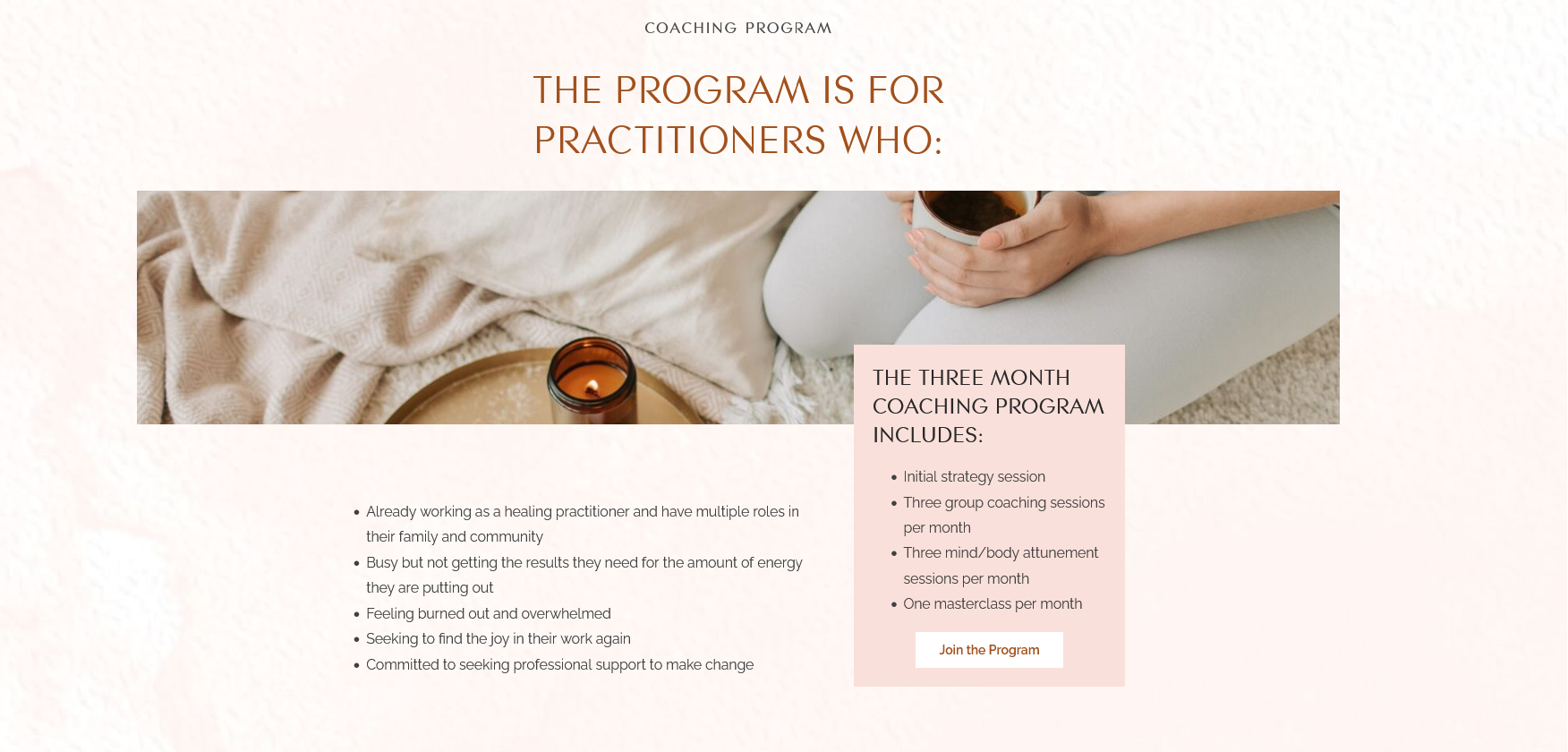
Designing Around the Programs
The coaching programs are an important part of the business, so the website needed to make them easy to discover and understand.
The three-month coaching program, for example, includes an initial strategy session, group coaching sessions, mind/body attunement sessions, and a monthly masterclass.
Instead of presenting this information as one large block of text, we structured the content into clear sections that allow visitors to quickly understand:
- Who the program is for
- What is included
- What the program helps with
- How to get started
This makes the program feel easier to understand and reduces the amount of effort required from the visitor.
Typography as Part of the Brand
Typography played an important role in translating the client's existing identity into the website.
Rather than treating typography as simply a way to display information, we used it as part of the overall visual personality.
The type hierarchy was designed to create a clear distinction between:
Large statements → Section headings → Supporting information → Calls to action
This allowed the website to maintain a sense of calm while still creating enough visual contrast to guide visitors through the content.
Designing for Trust and Connection
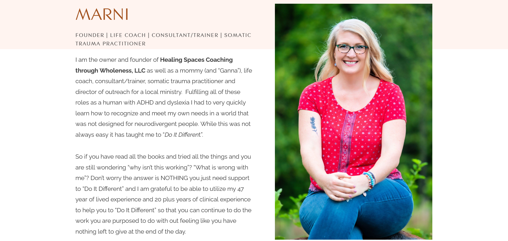
Because Healing Spaces is a founder-led practice, the person behind the business is an important part of the brand.
The About section introduces Marni, her experience, professional background, and the personal perspective that informs her approach.
We treated this information as more than a traditional biography.
The design gives the founder's story room to breathe and creates an opportunity for visitors to understand the person behind the practice.
For a service business built around relationships, that personal connection is an important part of the website experience.
Integrating Payments With Stripe
The website wasn't only designed to provide information — it also needed to support the business operationally.
As part of the project, we helped set up Stripe payment integration for the client's programs.
This allowed visitors to move from learning about a program to completing their payment online, creating a smoother experience for both the client and their customers.
The goal was to remove unnecessary friction from the process and give the business a reliable way to accept payments for its programs.
Designing the Conversion Journey
For a coaching business, conversion isn't necessarily about pushing visitors toward a single "Buy Now" button.
Different visitors may be at different stages of deciding whether the service is right for them.
We therefore created multiple pathways throughout the website:
Learn about the practice → Explore a program → Understand the offering → Book a consultation / Join a program
This gives visitors the information they need before asking them to make a decision.
The Final Result
The finished website brings together the client's existing brand identity with a more structured digital experience.
The result is a website that is:
- Brand-led — The logo provided the foundation for the visual direction.
- Human-centered — The design reflects the personal nature of the practice.
- Easy to navigate — Services and programs are organized into clear pathways.
- Content-focused — Information is structured to make complex offerings easier to understand.
- Conversion-ready — Visitors have clear opportunities to explore programs, make inquiries, and take action.
- Business-ready — Stripe integration allows the client to accept online payments for programs.
Most importantly, the website was designed to feel like an extension of Healing Spaces itself — calm, supportive, personal, and intentional.
Final Thoughts
At Devtoniq, we don't start a website project by choosing a template and filling in the content. We start by understanding the brand, audience, business goals, and existing visual identity. From there, we translate those elements into a digital experience that looks good, communicates clearly, and supports the way the business actually operates. For Healing Spaces, that meant taking an existing logo and turning it into a complete visual language — from colors and typography to layout, content hierarchy, user journeys, and payment integration. Your website should feel like your brand, not a template.
Let's work togetherYou Might Also Like
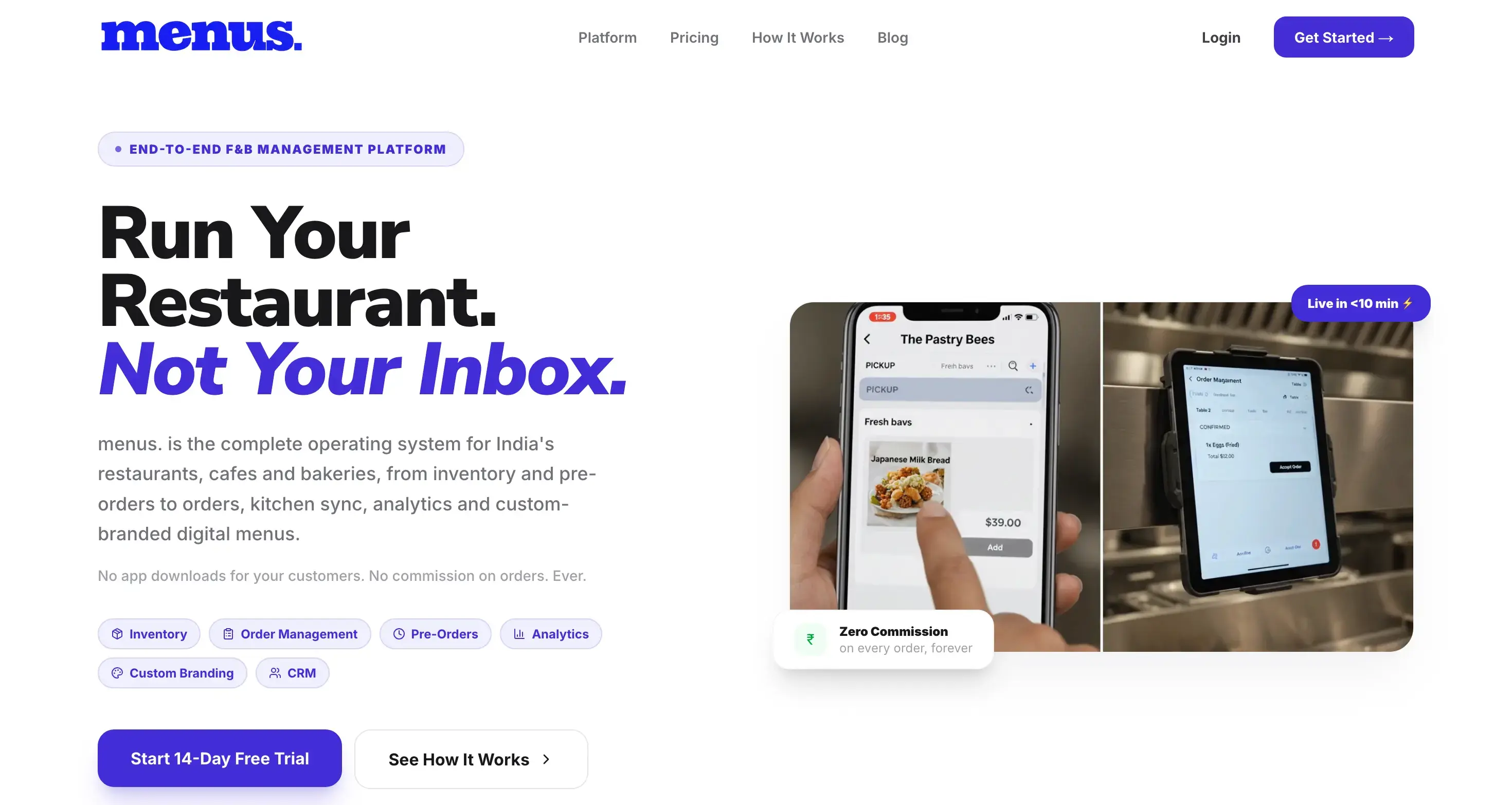
menus. — F&B Management Platform
A full-stack F&B management platform built by Devtoniq with Next.js. menus. brings digital menus, ordering, pre-orders, inventory, kitchen management, analytics, CRM, and custom branding into a single system designed specifically for restaurants, cafés, and bakeries.
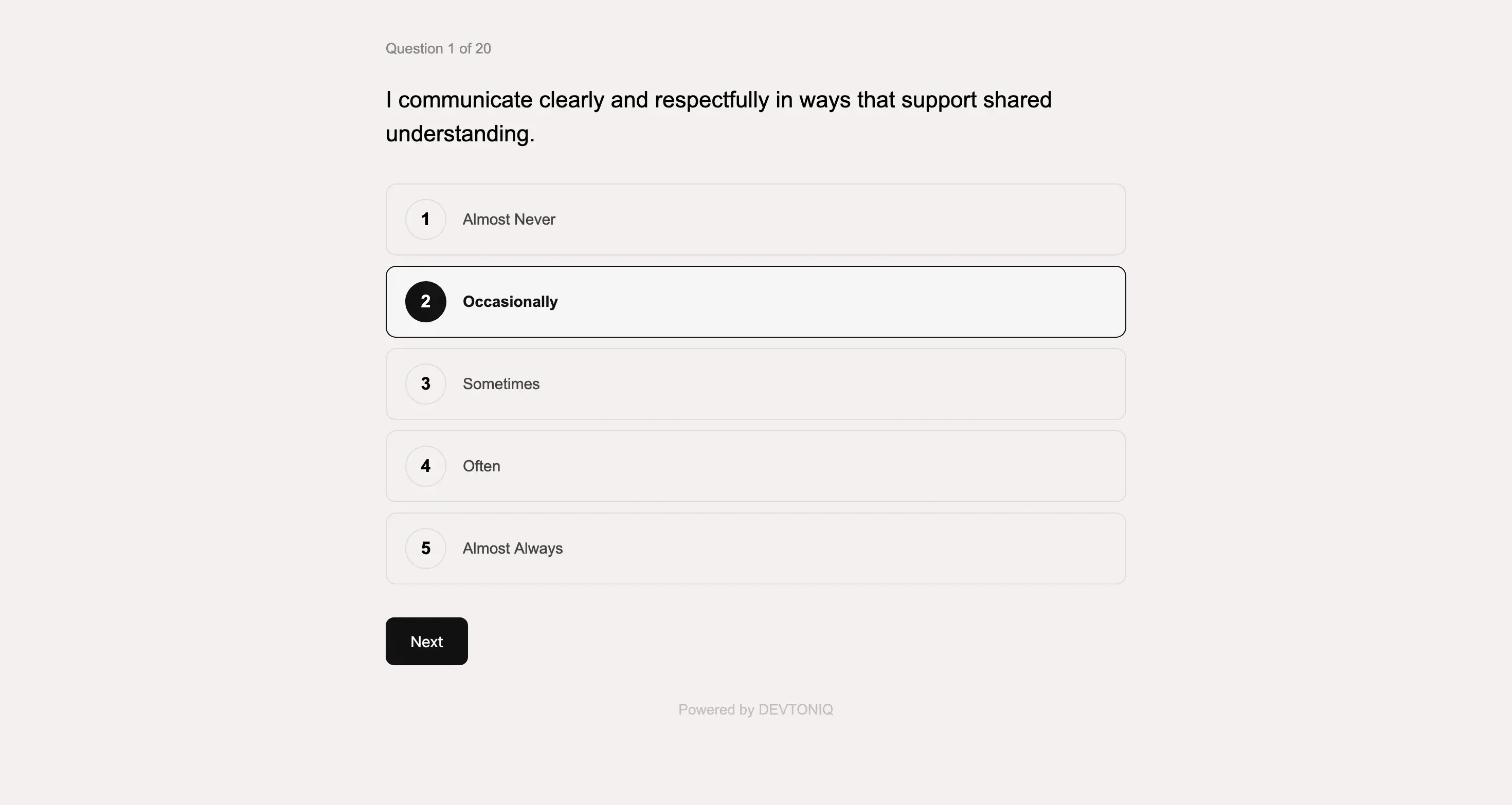
Custom Quiz & Assessment Platform
A custom interactive quiz and assessment platform built from a detailed client brief. I translated the client's questions, scoring logic, and result requirements into a complete experience—from the front-end Q&A flow to automated scoring, backend response management, and personalized email results.

Elia — Multi-Platform Website Template
Elia is a modern, editorial-inspired website template designed for creative entrepreneurs, agencies, and personal brands. Built by Devtoniq, the template combines bold typography, expressive layouts, and conversion-focused sections to create a polished digital presence without sacrificing usability.